 You’ve got traffic coming in, ads running, emails sent — but your landing page is where the magic either happens or dies. If your visitors bounce faster than a pop-up ad on a bad website, it’s time to rethink your approach. Creating a high-converting landing page isn’t rocket science, but it does demand a blend of psychology, design savvy, and razor-sharp clarity.
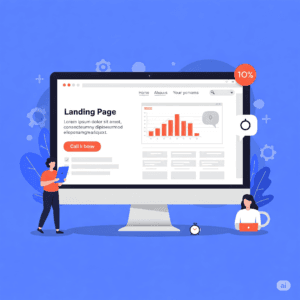
Ready to stop wasting clicks and start turning visitors into loyal customers? Let’s break down exactly how to build a landing page that doesn’t just look good — but sells.
1. Nail the Headline: Your First and Best Chance to Hook ‘Em
People skim. A lot. Your headline is the spotlight — if it doesn’t grab attention instantly, your visitor’s gone. Think benefits, not features. Instead of “Our Software Has 10,000 Features,” lead with “Save 3 Hours a Day With Our Time-Saving Software.”
Pro tip: Keep it clear, concise, and compelling. And don’t be afraid to speak directly to your ideal customer’s pain points.
2. Deliver Laser-Focused Value — Cut the Fluff
A landing page isn’t your entire website. It’s a one-way ticket to conversion. Every word, image, and element should push visitors closer to your goal — whether that’s signing up, buying, or downloading.
Avoid overwhelming your visitors with info overload. Instead, focus on one single, irresistible offer. Your copy should answer the question: What’s in it for me?
3. Use Visuals That Work Hard, Not Just Look Pretty
Humans are wired to respond to images faster than text. But not just any image will do. Use high-quality visuals that reinforce your message — product photos, real customer testimonials with faces, or short explainer videos.
Remember, every image should serve a purpose: build trust, illustrate benefits, or create emotional connection.
4. Keep the Call to Action (CTA) Bold, Clear, and Easy to Find
Your CTA button is the ultimate goal. Don’t hide it at the bottom of the page. Make it stand out with contrasting colors, simple language, and plenty of whitespace around it.
Instead of vague phrases like “Submit” or “Click Here,” try direct commands like “Get My Free Trial” or “Claim Your Discount Now.”
5. Build Trust With Social Proof and Guarantees
Nothing kills conversions faster than doubt. Add real testimonials, client logos, case studies, or trust badges to reassure visitors they’re making the right choice.
If possible, throw in a guarantee or risk-free trial. When people feel safe, they’re far more likely to say yes.
6. Optimize for Speed and Mobile
A high-converting landing page loses its power if it’s slow or clunky on mobile. More than half of web traffic comes from mobile devices — if your page doesn’t load quickly and look great on phones, you’re leaving money on the table.
Use clean code, compress images, and test responsiveness thoroughly.
7. Test, Analyze, and Refine
No landing page is perfect on day one. Use tools like Google Analytics, Hotjar, or A/B testing platforms (like Optimizely or VWO) to track visitor behavior.
Experiment with headlines, CTAs, images, and even color schemes to see what resonates best with your audience. Small tweaks can lead to massive conversion lifts.
Final Thought
A high-converting landing page isn’t just about flashy design or clever copy — it’s about understanding your audience so well you can guide them effortlessly from curiosity to commitment. Nail the message, remove distractions, and make the path to conversion crystal clear.
Your landing page is your brand’s handshake online. Make it firm, confident, and impossible to ignore.